The Daily Wait – Is Any Font Worth Waiting 60 Seconds To See?
Feb 7th, 2011 | By James Lewin | Category: Apple iPad 
Publishers of The Daily – the major new new app for the Apple iPad – have published a mea culpa at their blog, admitting that their app is buggy and saying that they are working on improving it:
We’ve had massive uptake since Wednesday’s launch, and with that kind of audience scale in such a short period of time, we’ve seen some stability issues and bugs that need to be addressed. We’re working as quickly as we can to find these problems and fix them. The beauty of the application ecosystem is that we can constantly iterate on and improve our product, and we’re aiming to put out an update within the coming weeks.
We value feedback and would like to thank our readers for what we’ve received to date. Our goal is to push this medium to its limits, experiment with new forms of content, and deliver a product that seamlessly balances great content with new technology. We want The Daily to be unlike anything else out there: intuitive, informative, entertaining, reliable and easy to use.
We’re on our way, and without your continued feedback we won’t get there. Keep it coming. We are addressing the technical issues that we’ve seen and we want you, our readers, to know that this is a major priority for us.
Thanks,
The Daily team
While the publishers acknowledge bugginess of their news app, though, they don’t discuss the core problem of The Daily: the app prioritizes magazine-style page layout over speed.
And is any font worth waiting 60 seconds for?
The Ugly Side Of Attractive Design
The Daily manages to make the iPad, which otherwise feels pretty zippy, feel sluggish.
Starting The Daily app is extremely slow – 60 second plus slow. Slow enough that you want to do something else while it loads.
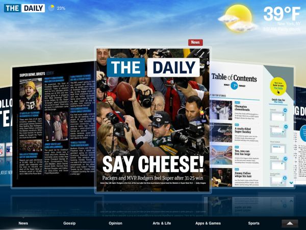
Once it loads, scrolling through stories, in a ‘Cover Flow’ style interface, is jerky. Gratuitous headline animation and messages to “Turn To See Story” make actually reading the news feel slower than it should be.
Any you can’t quickly skim it and then focus on what you’re interested in.
What The Daily is trying to do – bring gorgeous multimedia to your daily newsreading – is an obvious trend for new media. But the publishers seem to have let attractive design get in the way of useful design.
What do you think of The Daily? Do you think they can tweak the app to make it work – or do they need to start from scratch?
More at TUAW, Daring Fireball
The slowness is an issue but I might subscribe if The Daily was flexible enough to present a view of the news that was customized for me.
I don’t like waiting for it to load, knowing that it’s downloading fluff stories, like today’s story about Christina Aguilera flubbing the national anthem lyrics. Who cares?