iPad Peek Lets You See What Your Site Looks Like On An iPad – Except That It Doesn’t
Apr 5th, 2010 | By James Lewin | Category: Apple iPad, Podcasting ResearchMashable today highlighted a site called iPad Peek, calling it a “nifty tool that lets you see how any website will be rendered on the iPad.”
It sounds like a good idea, Unfortunately, iPad Peek doesn’t do much more than put a pretty iPad picture frame around the site you want to test.
iPad Peek works great – as long as you don’t care about:
- how text wraps;
- the size of type on the iPad;
- whether your graphics show up or not;
- the placement of images; or
- whether you get an accurate idea what iPad users will see.
It’s a little surprising that Mashable is promoting this – because no one should use iPad Peek if they are seriously interested in understanding how a site looks on an iPad.
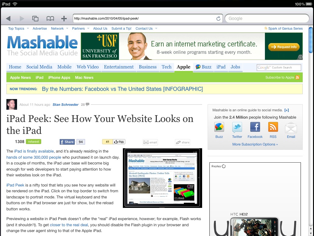
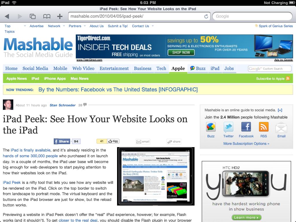
Here are screen shots of the Mashable home page, one from iPad Peek (above) and one from the iPad:
How many significant differences can you spot?
We stopped counting at 5.
Doing any site checking using something like iPad Peek would be irresponsible. On the other hand – it’s awesome if you just want to see how your site looks in a pretty iPad picture frame.


Looks like they got punk’d
The links at the top of the page wrap differently and the iPad version is missing the retweet button.
The graphic on the lower right is in a completely different position, too.
And all the flash videos on the adobe site play perfectly!
Next time you put up images to compare, it would be easier to see the comparison if the pictures were side by side, even if the user had to open a new window to see this. Think of the user next time and the point you are trying to get across before you start bashing other websites for there mistakes, thank you.