Google Blog Search No TechMeme-Killer…..Yet
Oct 2nd, 2008 | By James Lewin | Category: GeneralThere’s a lot of buzz today about a new window into the blogosphere, Google’s updated Blog Search.Â
Here’s what Google Product Manager Michael Cohen has to say about Blog Search:
Today, we’re pleased to launch a new homepage for Google Blog Search so that you too can browse and discover the most interesting stories in the blogosphere. Adapting some of the technology pioneered by Google News, we’re now showing categories on the left side of the website and organizing the blog posts within those categories into clusters, which are groupings of posts about the same story or event.
Grouping them in clusters lets you see the best posts on a story or get a variety of perspectives. When you look within a cluster, you’ll find a collection of the most interesting and recent posts on the topic, along with a timeline graph that shows you how the story is gaining momentum in the blogosphere.
Sounds a lot like Techmeme – except that it’s from Google and it has 11 categories.Â
Blog Search may bring TechMeme-style news aggregation to the mainstream, but it may have trouble challenging TechMeme for the tech world’s attention. Here’s why.
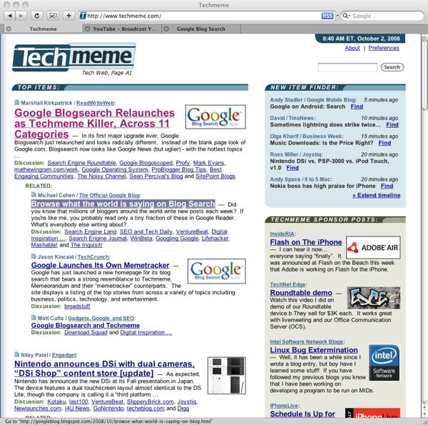
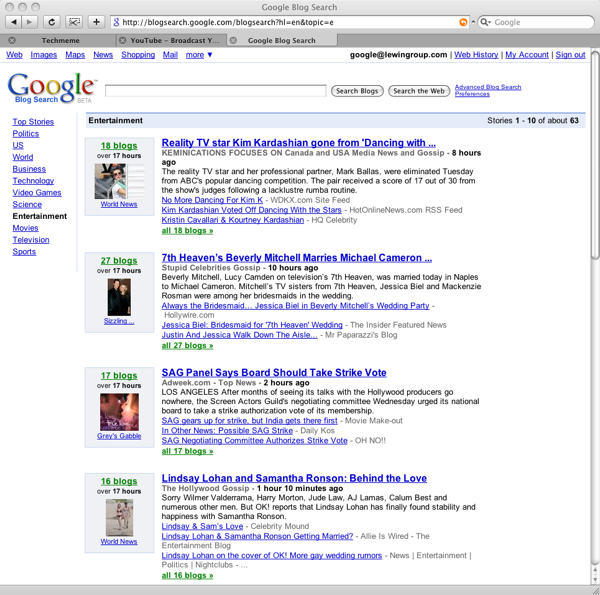
Blog Search displays much less information on screen than TechMeme. This may sound like a minor flaw, but Blog Search shows about half as many stories as TechMeme “above the fold”:
TechMeme shows 7 story headlines above the fold:

In the same space, Google Blog Search shows four stories:
TechMeme’s layout gives you a lot more information and makes it easy to understand what the top stories are in technology, at a glance.Â
TechMeme’s home page also does a better job of showing the conversations that occur around stories in the blogosphere.Â
Google’s obviously got the muscle to make a TechMeme killer – but they’ll need to go back to the drawing board and rethink their design.
