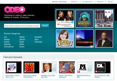
Odeo Back In Beta
Apr 18th, 2008 | By James Lewin | Category: Audio Podcasting, Streaming Video, Video Podcasts 
Odeo, an early podcasting startup that has long struggled with its direction, is back, in beta and looking for feedback.
While the original site focused on podcast creation, the focus of Odeo’s latest incarnation focuses on viewing and listening to Internet media.
Give it a look and let me know what you think of the makeover!
I’ve emailed them and they say that the odeo studio will be included when they go live as well. I’m really looking forward to that coming back. That was my favorite part of the site. We’ll see i guess.
what a big disappointment the new odeo beta is- on my end (three weeks now) its not worth spending another second on.
notes:
-my feeds don’t work.
-new user interface lacks in intuitive controls.
-help menu is not very helpful, its lack much needed.
this ship will fade because its rubish!
how are people seeing it? I signed up to have a look over a month ago and still can’t get in. I would love to have a look though, is there some direct link or something?
Odeo can just go away, they are run by a bunch of scammers and they need to be ignored by the community. They still have lawsuits pending and you cannot count on them being here for the long haul. To heck with Odeo
Tried Odeo out using Explorer and it froze the browser, nice job!
Tried Odeo out using FireFox and it choked so bad just loading and playing back a simple QT feed that I will now officially forget the name Odeo.
Who’s in charge over there? Their about section is as cryptic as you can get (for good reason I suppose).
Oh well, back to Miro.
Deadpool.
The new Odeo is a nice effort, but in my opinion they popped this cake out of the oven before it was fully baked. There’s a sharp division between content that was created with the “old” odeo (which is now at “legacy.odeo.com” and the new stuff since the beta became the primary site. Pre-existing podcast episodes don’t look right and can’t be fixed. Some lucky users are able to upload or link to new episodes, but most can’t yet. (They say it’s coming “in the near future”.) None of the text describing the episodes (old or new) can be edited, so once you post something — if you’re one of the fortunate few — and discover a typo or something else that you want to fix, too bad. Worse yet, valuable center-screen real estate in the new player interface is totally wasted with a EQ-bar style visualization that appears to have no relation whatsoever to the content being played. The display just bounces around at random,
If they’re able to clean up these bugs and restore the semi-decent production tools that had previously existed in the old Odeo Studio, I’ll be the first to offer kudos, but I think it was a major blunder not to have had these capabilities in place before launching the redesigned site.