MediaMelon Offers HD On Demand, But The Site Still Sucks
Nov 15th, 2007 | By James Lewin | Category: Internet TV, Streaming Video, VideoMediaMelon has launched what it calls a “pioneering Video Delivery Network” that enables content owners to deliver high-resolution videos on the Internet. According to MediaMelon, they are the first service to offer video downloads to be accessed and played from a web browser.
Unfortunately, the MediaMelon site requires a software install in order to work, is sluggish and is hard to use, compared to other video sites.
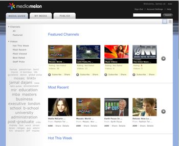
Here’s a view of video browsing within MediaMelon:

It’s a clean interface, but it uses a ton of space to display very few videos and very little information.
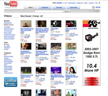
Compare this to YouTube:

YouTube packs twice as many video thumbnails, more than twice as many browsing categories and options, and a lot of additional information into the same browser space, and still manages to find room for a massive skyscraper ad.
Even more important, though, is the fact that MediaMelon is just much slower to navigate and find videos with. There’s also numerous usability quirks – like the fact that some thumbnail previews activate user options, and others do nothing – but none actually play the video when you click them.
Instead you have to find the “Add” link, which turns into a “Play” link, if you’ve previously added the video.
Want to share a video on your blog? Don’t look for “share” or “embed”. At MediaMelon they call this “Melonize code”.
That’s right: “Melonize code”.
Here, I’ve “melonized” Kylie:
If you don’t mind creating an account at the site, installing an application, navigating very slowly, suffering through poor usability, and being locked into viewing the videos with their software on your computer, MediaMelon at least provides nice video. We tried out a variety of videos and the quality was great.
The site may have some merits as a content hosting service, but it’s hard to imagine wanting to put your viewers through the trouble.
Unfortunately, using MediaMelon is a lot more confusing that it should be. A venture capitalist needs to slap the site’s designers around a bit. MediaMelon’s complexity eliminates the possibility that it could have the viral appeal of a site like YouTube, and puts barriers between content creators and their audience.
I think the comparison isn’t valid. I’m quite impressed by MediaMelon, and their logic.
* You can’t compare a video streaming site, to a video downloading site.
* YouTube has infinite content, and MediaMelon has just launched so there is a lots of scope for improvement. User interface will improve with time.
* YouTube has completely different market of short (lower quality videos) which they stream. Whereas mediamelon uses the same format in which user uploads a video.
* You need to download the client just once. But with this small one-time-pain, the client offers you so much. Video uploading and downloading is so much faster as compared to any other site. You can upload bigger videos without any problem.
I’m pretty sure there would be many more things which still needs to explored and which I missed. Its just the beginning for them and I must say good work MediaMelon, keep it up.
—
Steve
Steve
My question is why would you embed your video with MediaMelon? Do you want to put a video on your site that nobody can watch?
Actually, DiDGU.com first offered hi-def video via a browser a year ago. Unfortunately, their bank deal was shaky, their business plan sketchy, and their timing too early, so they are no longer around. Still, if nothing else, they *were* first.
http://www.madison.com/archives/read.php?ref=/tct/2007/05/03/0705030281.php
Eric
Hi, I am from mediamelon. Thanks for reviewing the site and comments.
The core value that we provide is ability for users to play guaranteed high-quality video from widgets that can be on any website. In other words, an iTunes experience without the need for a separate desktop UI. This allows content to be accessed/discovered more easily; and for content owners to make their content available at more places. Hence our efforts have been focused on getting the video playback quality good. You have said that “We tried out a variety of videos and the quality was great.” and we are glad to hear that. Many other sites say that they offer HD (such as hulu and move networks) but the user experience there will be restrained by the quality of connection you have, whereas we do some intelligent pre-caching that allows us to ensure better playback.
Regarding the website usability and navigation, we are continually improving it and actively soliciting feedback from our initial users to make it better. As Steve points in his comment above, there are several ways in which we are targeting a market that is different from youtube’s – and hence the UI and experience will evolve in a different differently.
Feel free to contact me on kumar at mediamelon dot com with any other ideas, feedback, questions.